
Technical Skills


Python
SQL
Excel
Tableau
Power BI
Data Visualization
Project Management
Projects
Driving DoorDash Decisions: Marketing Insights from Excel Data Analysis
September 2025
Have you ever wondered how companies like DoorDash decide who to target with their ads? I recently dove into this fascinating topic by analyzing some company data to uncover which demographic groups are the most valuable for DoorDash's marketing efforts. It was a surprising journey into the world of data-driven decision-making.This project stemmed from my curiosity about how DoorDash, and similar companies, can make the smartest choices when it comes to advertising. With the right insights, they can target the right people and maximize their revenues. This project felt special because it combined my interest in data with my fascination for real-world business strategies!Skills Used: Key techniques in Excel used for data analysis including Data Cleaning, Data Sorting/Filtering, Pivot Tables, Data Visualization & more!
About Me
Hi! My name is Jeremy Fonseca, and I recently earned my Bachelor of Science in Computer Science from Rutgers University – New Brunswick. With a strong foundation in software engineering and recent experience as a Founding Software Developer at BallQ—an AI-powered soccer analytics platform—I am now focused on pursuing a career in soccer data analytics.My technical skill set includes Python, SQL, Java, Excel, Tableau, data modeling, and backend development, along with hands-on experience building data pipelines and dashboards that translate complex datasets into clear, actionable insights. I am especially passionate about using data to support decision-making in player performance analysis, scouting, and tactical evaluation.What differentiates me is the combination of technical expertise and deep domain knowledge of the sport. I grew up playing soccer at the highest youth levels in the U.S., competed at the collegiate level, and have also played semi-professionally. This background allows me to understand the game beyond the numbers and apply analytics in ways that align with real on-field context and performance demands.Additionally, I work as a high level soccer referee, currently pursuing my regional referee license. With experience officiating at the semi-professional and collegiate Division 1 Levels, I have been taught to also analyze the game from an officials perspective, teaching me even more about tactical analysis in order to improve performance as an official.I am actively seeking opportunities as a Data Analyst within professional or semi-professional soccer organizations, where I can contribute analytical rigor, problem-solving skills, and a strong passion for the sport to drive data-informed decisions.Outside of work, I’m an avid runner currently training for a sub-3-hour marathon.Let’s connect — I’d love to explore how I can bring value through soccer analytics, data-driven insights, and innovative problem-solving.
Driving DoorDash Decisions: Marketing Insights from Excel Data Analysis
Have you ever wondered how companies like DoorDash decide who to target with their ads? I recently dove into this fascinating topic by analyzing some company data to uncover which demographic groups are the most valuable for DoorDash's marketing efforts. It was a surprising journey into the world of data-driven decision-making, and I’d love to share what I found!
Why I Chose This Project:
This project stemmed from my curiosity about how DoorDash, and similar companies, can make the smartest choices when it comes to advertising. With the right insights, they can target the right people and maximize their revenues. This project felt special because it combined my interest in data with my fascination for real-world business strategies! It also helped me use many key techniques in Excel used for data analysis including Data Cleaning, Data Sorting/Filtering, Pivot Tables, Data Visualization & more!
What You'll Learn:
By reading this article, you'll gain insights into which customer segments are most lucrative for DoorDash. You'll understand how different factors like income, age, and family size affect spending habits, and why these insights matter for marketing strategies.
Dataset Details:
For this project, I used a modified version of DoorDash's dataset from 2014-2016, featuring details from over 2,000 customers. It included vital information like age, income, number of children, and more, making it perfect for identifying key customer segments.
Analysis Process:
Using Excel, I analyzed the dataset by cleaning and transforming the data. I then created various charts, some using pivot tables, to visualize spending patterns and revenue contributions.
Visuals & Insights:
Impact Income has on Spending:
In the following scatter plot created using the data, it can be seen that as the total income of the customer rises, so does their total amount spent on the food delivery service. The trend line shows a clear upwards trend, with a coefficient of determination value of 0.6783, showing a strong correlation between the income of the customer and the total amount they will spend on DoorDash.
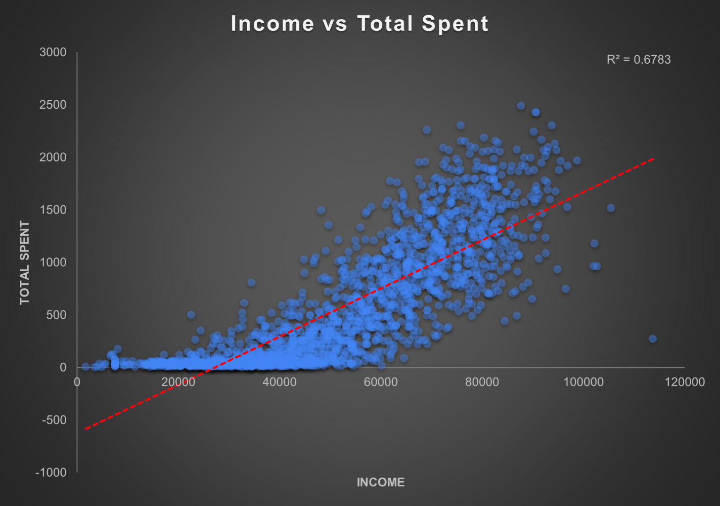
Scatter Plot showing Customer Income vs Total Dollar Amount Spent on Food Delivery
Furthermore, in the following pie chart created from a pivot table of the data, it can be seen that those customers in income groups making 60-90k and 90k+ made up over 75% of the total revenue generated, solidifying that the most revenue is being generated by those earning higher incomes (above 60k).
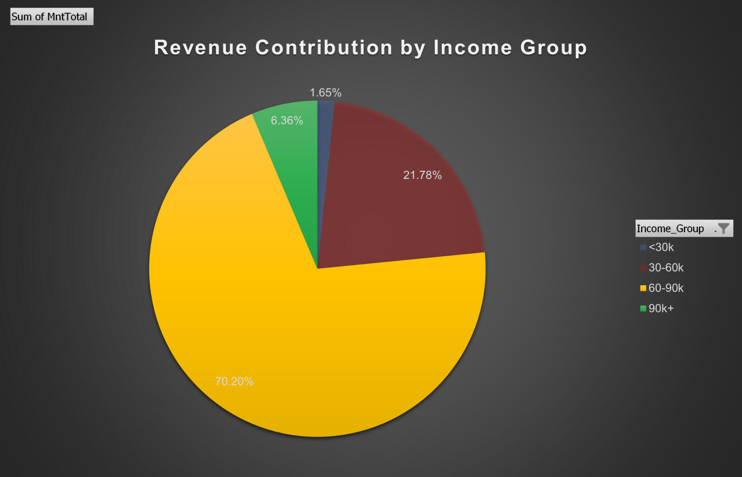
Pie Chart Showing Total Revenue Contribution by Income Group
Impact Income has on Spending:
Now we are looking at customer spending based on the number of children that they have or don't have at home. In the following two pivot bar charts, it shows that those customers that have 0 kids at home spent much higher on average compared to those with either 1 or 2 kids, and similarly, those with 0 kids also spent a much higher percentage of their total income on average compared to those with either 1 or 2 kids. This helps to show that customers with 0 kids are the both the highest spenders and those with the most willingness to spend higher percentages of their incomes.
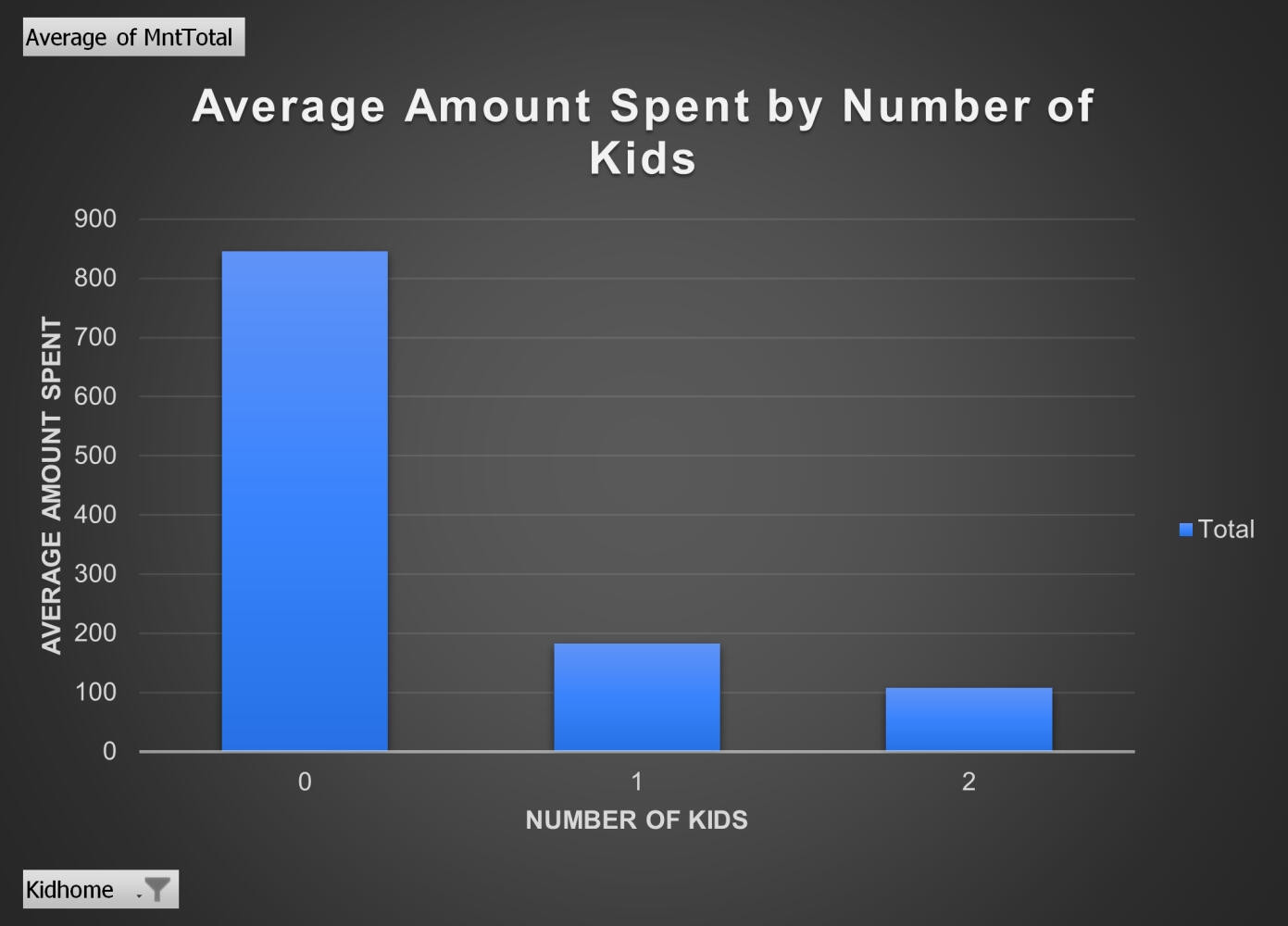
Bar Chart Showing Average Amount Spent by Customers categorized By Number of Kids they have
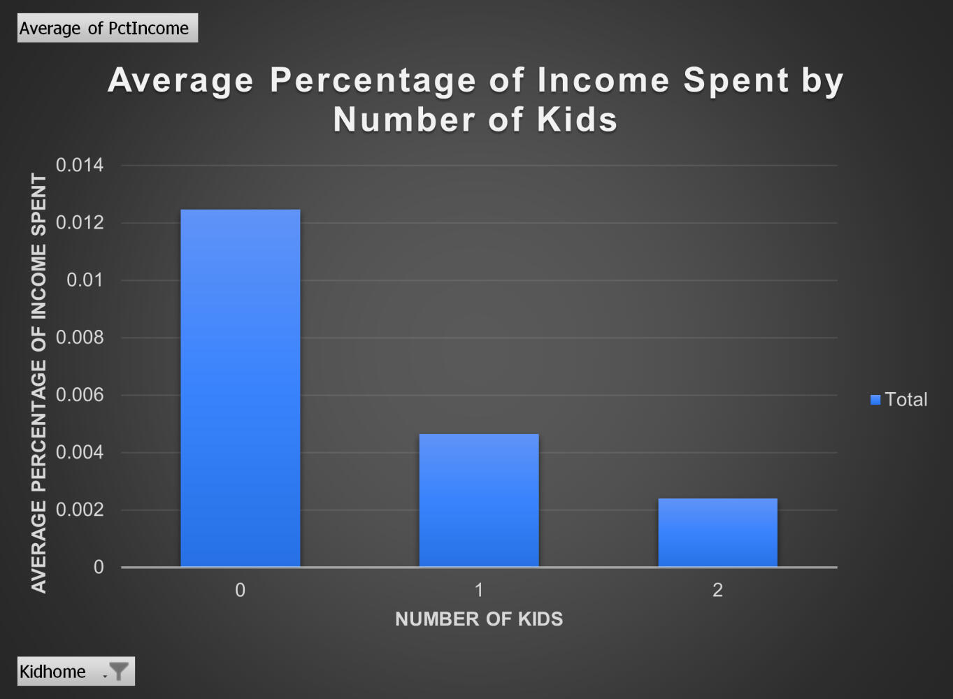
Bar Chart Showing Average Percentage of Income Spent per Customer categorized By Number of Kids they have
Furthermore, looking at the total revenue generated, this pie chart shows that those with 0 kids at home generated over 85% of the total revenue. This further solidifies the point that this demographic is the best to target.
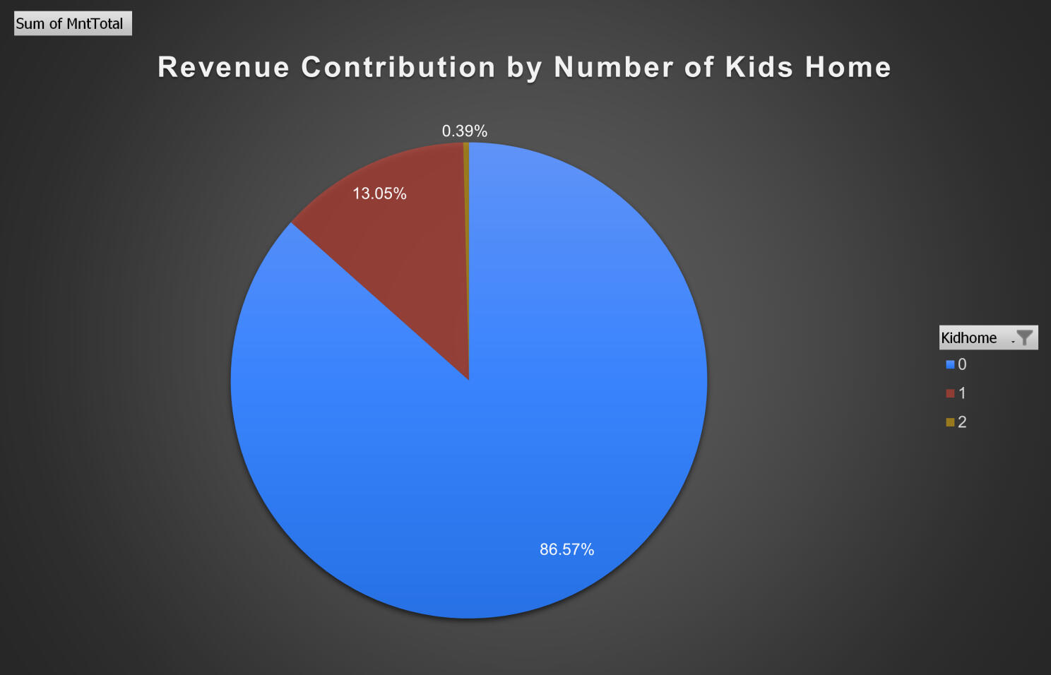
Pie Chart Showing Total Revenue Contribution by Number of Kids at Home.
Impact Income has on Spending:
For our third and final demographic category, we are looking at the age ranges of the customers on the platform. Using a pivot table from our data, I generated this pie chart which shows that those customers in the age ranges of 36-50 and 51-65 generated over 70% of the total revenue. This implies that those customers in these age ranges are the most profitable for the company.
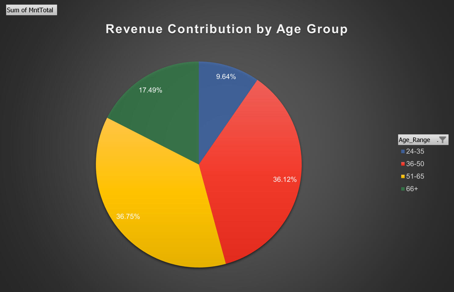
Pie Chart showing Total Revenue Contribution Categorized by Age Group
Combining the Three - Best Specific Demographic Segment:
Now to tie all three of these demographic segments together, I wanted to find which combinations of these three generated the most revenue for the company. This will help any marketing team know which specific customer type would be best to target marketing efforts towards in order to generate the best amount of revenue.In the following bar chart, I showed how much of the total revenue was contributed by each specific customer demographic, combining income, age group, and number of kids they have. It is highlighted in green to show which two specific customer types generated the most of the total revenue for the company. These two are: customers in the age range 35-50 earning 60-90k with 0 kids at home & customers in the age range 51-65 earning 60-90k with 0 kids at home. These two specific demographic segments both contributed to over 20% of the total revenue generated each, with the nearest other segment being those customers in the same income group and kids category aged 66+ contributing to 11.95% of the total revenue. This makes these two the best performing segments by far, making them the best to target with marketing efforts.
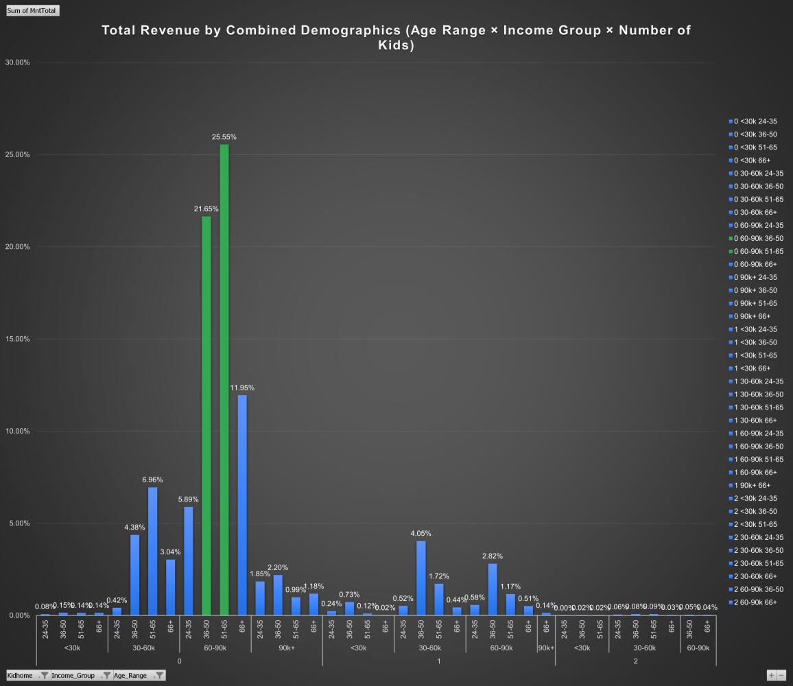
Bar Chart Showing Total Revenue Contribution categorized by Specific Demographic Segments
Main Takeaways:
Delving deeper, it became clear that DoorDash's marketing could significantly benefit from focusing on specific demographics. Those aged 36-50 and 51-65, making $60-90k, and with no kids, are the biggest spenders. By focusing marketing efforts on these groups, DoorDash could potentially see a considerable rise in revenue. This project highlighted the power of targeted marketing and the role data plays in making informed business decisions.
Conclusion and Personal Reflections:
This project taught me the importance of backing marketing efforts with data. I faced challenges in processing such a large dataset, but overcoming them has given me a new appreciation for the intricacies of data analysis. Moving forward, I’m eager to explore more on how data can drive smarter business decisions.
Recommendations:
For businesses like DoorDash, aligning marketing strategies with data insights is key. I recommend prioritizing advertising spend on high-value segments identified through data analysis to maximize returns.